IoT and Power BI for smarter cement plant operations

A cement plant generates millions of data points every day, including kiln shell temperatures, mill bearing vibrations, baghouse pressure differentials, finish grinding particle distributions, and preheater gas composition. Most of it sits in isolated DCS historians or SCADA logs, visible to one operator on one screen, invisible to the plant manager watching a spreadsheet. IoT in cement plants changes what happens to that data. Sensors across the production line feed a cloud platform that surfaces patterns operators, maintenance teams, and executives can act on in real time. The shift matters because cement manufacturing has two persistent problems conventional monitoring can’t solve fast enough: Quality variance across batches and unplanned kiln downtime. The quality gap: one hour between clinker and lab result Cement quality depends on variables that interact across the entire process: raw mix chemistry, burning zone temperature, clinker mineralogy, and grinding parameters. Two critical indicators are free lime content and Blaine fineness. Free lime, uncombined calcium oxide after clinker formation, needs to stay between 1% and 2%. Too high wastes raw materials and fuel; too low creates quality problems leading to rework or complaints. One plant using real-time free lime modeling (correlating free lime to NOx as a soft sensor) saved $600,000 per year: $300,000 in fuel and $300,000 in avoided quality losses (Seeq, 2024). Blaine fineness cement’s specific surface area in cm²/g controls setting time and strength development. During that hour, the finish mill may produce hundreds of tons outside spec. IoT sensor networks close this gap. Online particle size analyzers, continuous XRF monitors, and NOx-correlated soft sensors feed real-time Blaine and free lime estimates to dashboards, replacing the one-hour delay with continuous visibility into burnability index and product conformance. The downtime gap: $300,000 per day that didn’t need to happen A rotary kiln at a 1 MTPA plant generates roughly $300,000 in revenue per day. Every unplanned shutdown day is that amount lost plus emergency repairs running 18–25% higher than planned maintenance (UptimeAI; LLumin, 2025). Kilns run at 1,500°C. Vertical roller mills grind under severe mechanical stress. ID fans and gearboxes accumulate wear that time-based schedules can’t track precisely. Plants deploying IoT condition monitoring report consistent results. An international cement group across 15 production lines achieved 35% reduction in unplanned downtime, 15% lower maintenance costs, and 8% energy reduction (INNO, 2025). A Vietnam plant cut unplanned downtime 34% after consolidating 2.3 million daily sensor readings into unified dashboards (Oxmaint, 2026). Where the industry is heading: IIoT with AI at the edge Microsoft was named a Leader in the 2025 Gartner Magic Quadrant for Global Industrial IoT Platforms, reflecting Azure’s maturity for exactly this use case. Gartner projects that 95% of new industrial IoT deployments will include AI-edge inference, enabling anomaly detection at process-control speed. The smart cement digitalization market reached $3.2 billion in 2024 and is projected to reach $8.7 billion by 2033, growing at 11.8% CAGR. That growth reflects plants moving from stage one, connecting sensors to stage two: predicting failures and optimizing quality in real time. The technology stack: Azure IoT Hub + Databricks + Power BI Azure IoT Hub ingests telemetry from existing DCS and SCADA via OPC UA and Modbus TCP without replacing control systems. It handles millions of readings per day at sub-second intervals. Databricks on Azure provides the lakehouse where sensor data, quality lab records, and maintenance logs converge. Predictive models train here, correlating vibration signatures to bearing degradation, or kiln shell temperatures to refractory wear, using the plant’s own history. Power BI surfaces what matters to each role. Plant engineers see real-time Blaine trends and free lime soft-sensor readings. Maintenance managers see health scores and predicted failure windows. CXOs see OEE, energy cost per ton, and quality compliance continuously, not monthly. How Advaiya connects plant floor data to CXO decisions Advaiya’s BI and dashboards practice builds the intelligence layer between raw sensor data and business decisions. When Advaiya built a unified data platform for a conglomerate spanning manufacturing and infrastructure, the results reflected what cement plants need: 20% energy efficiency improvement, 10,000+ tons of carbon emissions reduced, and 300+ automated validation workflows replacing manual reconciliation. The approach starts with what the plant already has existing DCS, SCADA, and historians, and connects it to Azure and Databricks without control system replacement. Power BI dashboards are configured for each role, so data that took an hour to reach the lab now reaches the decision-maker in seconds. Connect with Advaiya about cement plant intelligence → FAQ Does IoT monitoring require replacing our DCS or SCADA? No. Azure IoT Hub connects alongside existing infrastructure via OPC UA and Modbus TCP. How quickly do IoT sensors show ROI? Most plants see returns within 3–6 months from prevented shutdowns. Full ROI arrives in 12–18 months. Can soft sensors replace lab-quality testing? Not entirely, lab testing remains the compliance reference. Soft sensors provide continuous estimates between samples, closing the gap where variance goes undetected. How is this different from a CMMS? A CMMS manages work orders on calendar intervals. IoT with Databricks and Power BI adds the predictive layer, flagging when equipment needs attention based on real-time condition data, not schedules.
ESG Reporting for Energy Companies with Microsoft Fabric & Power BI

ESG reporting for energy companies: Why the data problem is harder than the compliance problem ESG reporting in energy isn’t a once-a-year sustainability PDF. It’s a continuous data integration problem across every operational system a company runs. Scope 1 emissions come from generation facilities and fleet operations. Scope 2 tracks purchased electricity. Scope 3 is the hardest, requiring data from suppliers, contractors, fuel logistics, and downstream customers. Add safety incidents, workforce diversity, board composition, and audit trails, and you’re pulling from dozens of source systems managed by different teams. Only about 16% of companies maintain adequate data infrastructure for sustainability integration into their overall strategy (Microsoft, 2025[1]). For energy companies generating thousands of sensor readings per hour from SCADA, IoT, and AMI meters, the gap between data availability and reporting readiness is where compliance risk concentrates. The regulatory pressure is compounding In India, SEBI’s BRSR requires the top 1,000 listed companies to disclose 140+ ESG parameters. BRSR Core, mandatory for the top 250, requires independent third-party assurance on Scope 1 and 2 KPIs (SEBI, 2023). Value chain disclosures become applicable from FY 2025-26, with mandatory assurance in FY 2026-27 (SEBI/KPMG, 2025). Globally, the EU’s CSRD mandates reporting for over 50,000 companies. India’s Carbon Credit Trading Scheme (CCTS), operationalized in June 2025, adds compliance-driven emissions trading. Gartner’s May 2025[2] sustainability trends report confirmed it: mature sustainability data management is now essential, and companies increasingly need AI to stay accurate across inconsistent regulatory environments (Gartner, May 2025). Where ESG data management breaks down at scale Three failure patterns recur across energy companies: Scope 3 is a black box. Upstream and downstream emissions require supplier data that most partners, especially MSMEs, don’t track. Without automated ingestion, Scope 3 defaults to spend-based estimates that auditors increasingly challenge. Internal and external numbers diverge. Operations teams track emissions for operational decisions. Sustainability teams prepare disclosures from different data extracts. The reconciliation gap becomes an audit finding. Reporting is reactive, not continuous. Months of manual consolidation produce stale data by filing time. With BRSR moving toward quarterly disclosure and CSRD requiring near-real-time governance, annual batch processing doesn’t hold. How the industry is moving: automated ESG data pipelines The shift is from manual spreadsheet-based disclosure to automated ESG data pipelines and continuous systems treating sustainability data with the same rigor as financial data. 85% of business leaders agree that sustainability investments protect organizations from disruption (Gartner, 2023). Forrester’s ESG Data and Analytics Wave (Q3 2024) confirmed that the need for comprehensive, accurate ESG data has only strengthened and that buyers should prioritize centralized data management that ingests, validates, and reconciles from multiple sources (Forrester, 2024). Energy & utilities is now the fastest-growing ESG software segment at ~19% CAGR through 2035 (Roots Analysis / Mordor Intelligence, 2025). The competitive divide isn’t between companies that report and those that don’t, it’s between those with continuous, auditable ESG data estates and those still patching together disclosures from disconnected systems. The technology stack that closes the gap Microsoft Fabric provides the data foundation. Its sustainability data solutions include a 400+ table ESG data model covering carbon, energy, water, waste, biodiversity, social, and governance data with prebuilt connectors for IoT, ERP, SCADA, and third-party systems (Microsoft). Metrics computation aligns with CSRD/ESRS, BRSR, GRI, TCFD, SASB, and IFRS S1/S2, including all three emission scopes. Fabric’s data lakehouse gives every metric a documented lineage chain source record through transformation to disclosure figure, exactly what BRSR Core assurance demands. Power BI connects directly for live ESG dashboards: GHG intensity, energy consumption, water footprint, and safety metrics against targets. Disclosure exports can be generated for auditor review without manual formatting. Copilot integration lets sustainability teams describe analyses in plain language. For companies on the Microsoft stack, Dynamics 365, Azure IoT Hub, and operational data flow into a single ESG data estate no parallel infrastructure needed. How Advaiya helps energy organizations get there When Advaiya built an integrated ESG Board for a diversified conglomerate spanning energy and infrastructure, the challenge was precisely this: no unified ESG data platform, complex compliance across sectors, and high demand for robust reporting. Results: 10,000+ tons of carbon emissions reduced, 20% energy efficiency improvement, 50,000+ tons of waste reduction, 300+ automated data validation workflows, and 100% governance compliance. Advaiya’s ESG Board App accelerates deployment with preconfigured KPI tracking, automated validation, and disclosure-ready templates built on the Microsoft stack with direct experience across energy, utilities, and infrastructure clients, including BSES and Resound Energy Services. Talk to Advaiya about ESG reporting infrastructure. FAQ What ESG frameworks does Microsoft Fabric support? Prebuilt metrics for CSRD/ESRS, plus support for BRSR, GRI, TCFD, SASB, and IFRS S1/S2 (Microsoft Learn). The data model is extensible for additional frameworks. Can Fabric handle Scope 3 data from external suppliers? Yes. Integration templates support third-party ingestion and prebuilt Scope 3 calculation logic. Establishing supplier data-sharing protocols before automating improves output quality significantly. How does Power BI support BRSR Core audit assurance? Every Power BI metric traces to its source through Fabric’s lineage chain. Auditors review provenance, transformation logic, and methodology within Fabric, reducing the back-and-forth typical of manual disclosure. What's the difference between Advaiya's ESG Board App and Microsoft Sustainability Manager? The Sustainability Manager provides core emissions tracking. Advaiya’s ESG Board App adds preconfigured KPIs, automated validation workflows, and templates tailored to Indian regulatory requirements (BRSR/BRSR Core). Sources: [1] New AI & Data Solutions in Microsoft Cloud for Sustainability: From Pledges to Progress (Microsoft Blog) [2] 5 Trends Shaping Sustainability Strategies in 2025 (Gartner) [3] 85% of L&D Leaders Anticipate a Surge in Skills Development Needs Due to AI & Digital Trends (Gartner)
How the HR sector is leveraging data better using HR analytics

Companies produce a lot of HR data. Especially in larger organizations with a big employee base, HR is a significant part of operations. Human resource data can be used by businesses to track trends and measure productivity or identify growth areas. Many businesses don’t leverage this data enough. This can lead to decisions that are not in line with the capabilities or capacities of the human capital. In manpower-oriented companies, particularly in the service sector, HR KPIs are very relevant to business goals. Business leaders and managers can use human resource analytics and KPIs to make the most of valuable insights. KPI reports are visual representations of key performance indicators data. This format makes it easy to analyze and provides immediate insight. Advaiya’s BI and analytics solutions provide HR Analytics dashboards that include reports, and analytics features. In HR analytics software, all your reports can be found in one location. All your data is consolidated, and you can access it all at once, which speeds up data collection and improves efficiency. Using data analytics in human resource management The HR department in traditional terms is often seen as old-fashioned and most HR work is based on intuition. For a long time, HR has done things in the same way and because HR is not known for bringing in revenue like sales or operations we typically don’t think about measuring or quantifying its success. However, this is possible through HR data analytics. Many of the problems we have just mentioned can be solved by being more data-driven and knowledgeable about HR and analytics. Let’s ask a few questions: What is the annual turnover of your employees? What percentage of your turnover is due to regrettable loss? Are you able to predict which employees are most likely to leave your company in the next year? These questions cannot be answered without HR data. The first question is easy to answer for most human resource professionals. However, answering the second question can be more difficult. This second question requires you to combine data from multiple sources, such as Human Resources Information System (HRIS), and a performance management system. This is where HR analysis tools and dashboards come in. Analytics in HR provides insights into the best ways to manage employees and achieve business goals. It is crucial for HR teams they first identify the most relevant data and how to use it to maximize ROI. An HR analysis software can help you understand your business and assist you in developing plans to optimize talent investment while effectively monitoring recruitment, development, accountability, retention, and other workplace initiatives. How can HR Analytics help organizations track their employee KPIs? Employee engagement KPI – Absenteeism rate The absenteeism rate is an indicator that measures the absence rate for employees due to delays, sick leave, or excused absences. This indicator will help you plan for future absences and adjust your business strategy in order to avoid them. The average hour worked data can be used by HR managers to calculate key HR KPIs. This will allow you to see the cost impact of absenteeism. It will be much easier to budget for preventative strategies once the true cost of absenteeism has been established. Talent rating HR analytics can help identify high-performing new hires. This meaningful insight helps to determine if they should move into fast-track programs. Average stay Many employees leave because they don’t have enough time to stay in the same job. Many employees will look for opportunities outside the company if they aren’t promoted. HR analytics help you identify the average time it takes an employee. It will ascend, simply count the time it takes each employee to complete the same task. To divide the result by all employees. It might be a good idea for you to talk with management if there are not many opportunities for growth in the company. Explore our live HR analytics dashboard example Productivity KPI – KPIs that measure the efficiency of your workforce include the employee productivity rate. This KPI measures efficiency by calculating how long it takes employees to accomplish a task or achieve a goal. It determines the efficiency of each employee’s output and the speed at which they can complete the task. It can be used by HR departments to determine if operational adjustments are necessary to improve employee as well as enterprise productivity. This KPI is difficult to quantify as it only measures the work done. Some sectors may find it difficult to add quality measures to the output. It’s often difficult to measure quality. However, with business intelligence tools for HR, HRs can measure the metrics and indicate how productive a team is. Sociological KPI– Sociology gives managers the necessary knowledge to understand their customers and employees. Sociology knowledge allows business leaders to respond to employee problems and meet customer needs in a way that is not possible for others. Sociology at work can help you cultivate innovation and increase your competitive advantage. Companies are working to reduce gender inequality and reap the benefits of gender diversity within their companies. It is important to understand the size of the gap and its causes in order to close it. Many companies lack sociological data about their talent pipeline and their workforce over time. They are unable to pinpoint problems and launch targeted interventions to address them. While monitoring the gender pay gap is a useful baseline measure, it doesn’t provide enough information. Advanced analytics is required to enable organizations to measure sociological metrics such as gender diversity by role and female-to-male ratio, ethnic diversity, and turnover rate per group. This will help them improve their work culture. Recruitment KPI – The recruitment KPIs enable HR professionals to optimize their recruiting process, increase productivity, and improve their performance. In-the-moment actionable insights such as employee turnover rate and cost per hire, conversion rates, dismissal rates, time-to-fill, part-time employees, and other metrics allow HR professionals to make smart strategic decisions in order to achieve their recruitment goals.
How BI is revolutionizing manufacturing operations daily

Manufacturing processes are becoming more intricate, from inbound materials to tracking details. This necessitates informed decision-making based on accurate information by using business intelligence solutions. Leading companies have been utilizing meaningful insights from data to create data-driven stories, and this allows end users to consume data easily and make informed decisions. The manufacturing sector generates a large amount of data, so BI software (such as Microsoft Power BI) is an ideal fit. BI software can assess and identify inefficiencies in your operations while streamlining workflows by processing large amounts of digital information and creating easy-to-read reports. Analytics is becoming more widely adopted among process manufacturing companies, with the market projected to grow from $8.6 billion in 2021 to $27.6 billion by 2027 at an annual compound growth rate of 21.4%. Furthermore, 76% of manufacturing businesses have already adopted artificial intelligence-driven robust solutions such as manufacturing analytics since 2021 – up from just the previous quarter. Distinguish between ERP systems and business intelligence software Before we continue, let’s not forget that business intelligence software is distinct from an enterprise resource planning (ERP) system you may already possess. ERP platforms provide a solution to break away from data silos. They create one centralized data architecture to store, manage, and collect digital information. You can integrate data from accounting software, CRM platforms, and supply chain monitoring solutions into this comprehensive strategy for improved data quality and insight. Business intelligence platforms, however, analyze all data, anticipate future patterns, and create dashboards for easy interpretation of manufacturing insights. ERP tools collect enterprise data, while business intelligence software analyzes it and can make predictions about future business performance. ERP systems integrate information from various departments, while BI tools present this combined digital information so company leaders can quickly make informed decisions. Real-world use cases of business intelligence in manufacturing Enhancing facility efficiency Analytics tools are an indispensable resource for judging and enhancing efficiency. Managers should utilize BI first to establish a baseline performance level, identify problems, then assess how changes over time affect employee outputs individually and collectively. It provides invaluable insight into employee productivity levels. Manufacturers use business intelligence to enhance their quality control efforts. BI can analyze metrics like yield percentage, process uptime, and capacity utilization to predict assembly line failures due to ineffective quality control by analyzing the line’s end results and returns. This predictive analytics component of BI enables corrections before costly recalls or discards occur – helping protect a company’s reputation in the process. There are many BI-related metrics that can be used to detect inefficiencies within a manufacturing environment. BI can even help businesses determine optimal warehouse configurations, helping them save money and ensure efficient operations. A manufacturer might track how far workers must travel within the warehouse to retrieve materials; using analytic solutions, managers could decide if the material should be moved closer to workers to reduce transit times and delays or if another aspect of their process should change. Manufacturing teams will gain deeper insight into different actions and uncover new strategies based on this interconnectedness. Predictive maintenance and fault prediction Manufacturing has relied on preventive maintenance for decades. Manufacturing BI can be utilized to avoid unplanned breakdowns, with prescriptive analytical dashboards offering even greater insight. With predictive maintenance, technicians can anticipate when a breakdown will happen and how likely it is. By making repairs when convenient, technicians also save time ordering spare parts ahead of time which reduces downtime and boosts productivity. Robotization – AI-powered tools Robotic Process Automation (RPA) is powered by data from manufacturing analytics. This information is then converted into instructions using AI algorithms and used to identify potential opportunities for automating or robotically altering a factory, helping executives decide where best to begin and ensuring the most valuable business processes are automated first. The ‘Food & Beverage’ and ‘Oil & Gas industries often have many intricate processes that could potentially be automated. Utilizing analytics for an informed decision-making process will enable leaders to implement RPA successfully. Revenue growth and cost reductions Managers of manufacturing rings should assess whether they possess the data necessary to accurately gauge the financial consequences of their decisions. Business intelligence (BI) provides valuable business insights that demonstrate how changes in inventory, processes, and financial outcomes are connected. Business intelligence is perfect for illustrating profitability and risk profiles, such as the potential rewards or risks of introducing an intricate (but profitable) product range. By easily calculating overhead costs like inventory turns and dollars-per-unit before expanding operations, manufacturers can achieve economies of scale. Managers are able to keep an eye on competition using BI data like retention penetration rates, customer acquisition metrics, and market share. Manufacturing is no different; profit margins are the foundation of every successful business. Business intelligence tools enable you to delineate the profit contributions from each manufacturing segment and customer. Furthermore, data about the overall margin spread provides a comprehensive picture of profitability. The supply chain refinement Factories still struggle with broken supply chains, which can cause delays or damage to shipments and raw materials. With advanced analytics, factories gain visibility into their entire supply chain so they can better assess risks due to adverse weather or traffic issues, measure supplier reliability cost-effectively, negotiate more advantageous contracts, and track shipments from suppliers through the customer to identify any problems in the chain. This provides them with valuable insights for making informed business decisions and optimizing processes. Want more information about our BI solutions? Connect with us! Food and beverage factories must take special care with their supply chains, which are often long with components that must be kept at specific temperatures or environments. Delays in shipment or prolonged exposure to sunshine, dampness, or cold can cause damage and/or pose a health hazard. Factory owners are kept informed via manufacturing analytical tools when raw materials arrive late so they can find alternative suppliers or switch up their current provider. Enhancing internal and external communications Advanced business intelligence software tools like Power BI that integrate multiple data sources
Why businesses need BI tools for smarter decisions
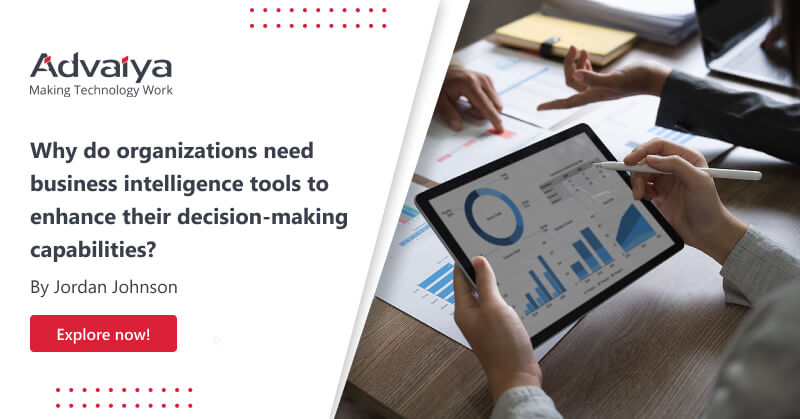
These days, business intelligence is on the rise. While some business owners still believe small businesses don’t require data analysis or that business Intelligence won’t add value to their operations, the reality is that any business can benefit in today’s data-driven world. Good business decision-making can produce beneficial outcomes, just like any other decision. An intelligent business decision-making process relies on data analysis. The initial step when using Business Intelligence in a decision-making context is to recognize and define the problem at hand; this could take the form of strategic planning or even simply outlining a company’s mission statement and values. Companies can utilize business intelligence to gain valuable data that will assist them in reaching their business objectives. Teams responsible for gathering this intelligence can analyze customer interactions on chat, voice calls and emails to uncover information such as preferences, likes and dislikes, technical difficulties experienced by customers, reactions to promotions and the experience customers have when shopping online – all of which can be used to boost conversion rates and other aspects of operations. Here are a few pain points that organizations are facing today and how business intelligence can solve these challenges and improve decision making A lack of data infrastructure leads to lackluster control over key business processes. Your data quality and analytics processes are often of paramount importance. The design of your dashboard’s HTML also plays a significant role in conveying complex information to decision-makers, helping you turn insights into action. Real-time data collection, lack of interactivity and rigid templates can all make implementing a dashboard challenging. Companies should opt for highly customizable dashboards that highlight correct data values while offering broad personalization options to meet their company’s individual requirements. Your business intelligence management can be enhanced by selecting the appropriate dashboard type. Analytical dashboards offer a comprehensive view of actionable insights, while operational ones provide real-time reporting specific to a department. A strategic dashboard offers executives an executive summary of key KPIs. Your revenue data may differ from the evaluations of offline and online marketing data. Your outsourcing or marketing agency can provide you with colorful reports when investing in advertising campaigns using platforms such as YouTube, Google Ads, and Facebook. These figures demonstrate that everything is running smoothly; no need to take their word for it when you can see the results for yourself. You can identify which marketing activities bring in the most profits and which ones cost you the most. That is why creating an individual attribution model is so essential; it will depict your funnel steps accurately, complete with real revenue data. This model will enable you to identify which channels are generating leads and revenue, engaging your audience or draining your budget. Your channel estimates will be more precise with more data in your attribution model. Combining Business Intelligence software with an appropriate attribution model enables: All data should be included in your calculations. Create a model based on real-world purchases and add offline data as well. You don’t need to sift through thousands of reports just to get an overview of what’s happening with your channels. Limited information access due to technical staff. Though having unlimited access to all data within an organization may seem ideal, it is not always the case in reality. Most legacy systems lack flexibility, so data scientists must extract valuable insights from the system and distribute them across all levels. The democratization and accessibility of information are greatly enhanced through the use of Business Intelligence tools. Cloud databases like Azure or Google Cloud enable even business users without technical expertise to quickly access company data. The same thing isn’t going to help your company grow. Increasing the budget won’t help. Management can make informed decisions using BI systems. Data-driven decisions take the guesswork out of making decisions; you don’t need to recall what happened last year or what your competitors are up to – all you need is revenue and expense data that’s already stored in your advanced analytics system. With this kind of business intelligence platform, predicting results from your plan becomes easy. Businesses don’t measure the right indicators. Organizations often measure financial KPIs quickly and accurately. Unfortunately, many stop there. While these measurements are essential for reporting purposes, SMEs need to pay closer attention. A comprehensive Business Intelligence plan is essential for measuring progress and performance within an organization as well as between departments/offices or in comparison to others within its industry. Furthermore, KPI data can also be used externally by comparing company performance with others within that same sector. Online KPI dashboard tools are invaluable resources for small and medium-sized enterprises (SMEs). With these programs, entrepreneurs can easily view their numbers and tailor them according to their individual requirements. Dealing with the consequences of poor data quality. Accurate detection of errors in large datasets can be a costly mistake, leading to financial losses, reputational harm, inaccurate targeting and uninformed decisions. Therefore, it’s essential that data quality be prioritized when making any business decision. Bad data can have a devastating effect on sales and marketing initiatives. For instance, your mailing lists could be dirty, contain inaccurate contact info, or include addressees who have unsubscribed. Ultimately, bad data leads to losses of customers and high churn rates. Data preprocessing is essential for accurate and dependable predictive analytics. Unfortunately, data scientists often lack time to do thorough preprocessing due to a lack of resources. Microsoft Power BI platforms can help eliminate manual data cleansing tasks by running the Power Query editor automatically to detect duplicates, missing values and errors – thus eliminating another hurdle from your company’s productivity. Wrapping up BI tools have become increasingly critical to enterprises in order to gain key insight, stay competitive and maximize their growth. BI is the process of extracting insights and analytics from raw data in order to enhance business decision-making. Businesses of all sizes must be able to effectively analyze, monitor, manage, visualize and understand their data in order to formulate appropriate business strategies and make informed
Connecting Oracle database to Power BI

Microsoft Power BI is one of the leading tools for analyzing data and generating insights. Power BI is a unified, scalable platform for self-service and enterprise-level business intelligence (BI) tools which helps in connecting to and visualizing any type of data and generating insights from it which help in making better business decisions. With Power BI, amazing data experiences can be created; sharing and collaborating data across other Microsoft tools become easy. Power BI also has AI capabilities which help to get answers to business questions in a conversational manner. This powerful reporting tool has 150+ connectors. One of the popular data connectors is the Oracle database which is a Java-based object that implements the javax. SQL. The Oracle database is one of the world’s leading converged, multi-model database management system (DBMS) and has in-memory, NoSQL, and MySQL databases. Oracle database products reduce operational costs by up to 90%, protect against data breaches and provide high-performance versions of the Oracle database to its customers. Pre-requisites: Microsoft Power BI Desktop (preferably 64-bit should be installed) Oracle Data Access Client (ODAC) software 11.2 or greater The ODAC is comprehensive client support for advanced Oracle database functionality, including performance, high availability, and security. In order to connect to the oracle database, the Oracle.DataAccess.The client should be installed. Visit the website below to install it. https://www.oracle.com/database/technologies/odac-downloads.html Oracle Server 9 and later Oracle server is required for enterprise workloads to achieve high performance, security and reliability when using Oracle’s extensive portfolio of x86 and SPARC servers. Installation Steps to Connect Oracle database to Power BI During the installation process, step 8 asks to mention the details as per the client TNSNames.ora file. (If not given ask the client to provide one). This includes the port number, connection string, database, and DNS which will ensure the connection. A typical tnsnames file could look like as below. Oracle Power BI Connection: After the successful installation of ODAC and proper tnsnames.ora file configuration now heads back to Power BI for connection setup. Go to Get Data and open More. Go to Database and select Oracle Database. A pop-up window will appear asking for server details, data connectivity mode and advanced options asking for providing command timeout and SQL script. (Note: Advanced options are not mandatory) In the Server provide the details mentioned in tnsnames.ora file in the format ipaddress;hostserver name Select the connectivity mode. The authentication pop-up window will appear where the authentication mode can be selected, and appropriate credentials can be provided. After a successful connection, the tables and views present in the database would be visible and analysis can be done. Using these steps, the data within an Oracle database can be easily analyzed, visuals can be created, and insights can be generated. Deepanshi Ranka Deepanshi Ranka is a Senior Associate in BI & Analytics team at Advaiya. She is a Microsoft certified Data Analyst and has an experience of over 3 years. She specializes in analytics, reporting and analytical tools that work seamlessly with business intelligence, data warehousing, architecture, data modelling, and cloud solutions to create effective solution models and optimize the operations.
Generate dynamic token and get data from Custom API in Power BI

There are times when the Power BI report should consider custom API as its data source. The custom API has token-based authentication. To get data in Postman, there are two steps – 1. Make a Post API call to get the token. 2. Make a Get API call to get data and pass the above token for authentication. As the token expires after a specific duration, we must generate a token before every get call to get the latest data updated in Power BI. This blog will guide you on how we can generate tokens dynamically inside Power BI before every GET call. Determine the authentication method required by the custom API. Common methods include API key, OAuth, or other token-based authentication. Steps to generate dynamic token and get data from Custom API in Power BI 1. Generate Access Token in Postman: Make an API call for token generation in Postman and copy the token. 2. Use the above access token in the Power BI report to get the data(temporary)- a. Open Power BI desktop. b. Click on Get data > Select Web > Click Connect c. Select Advanced. d. Paste the API URL of the data source from where you want to get the data. e. In the header section write Authorization and in value ‘Bearer <<Token generated from Postman>>’ f. Click OK g. It will open the Power Query editor like below 3. Create a query to generate token dynamically- a. Select New Source > Blank Query b. In the Advance Editor write the below code and Click Done- let url = <<API Url for token generation>>, headers = [#”Content-Type” = “application/json”], postData = Json.FromValue([username=”<<User Name>>”, password= “<<Password>>”]), response = Web.Contents( url, [ Headers = headers, Content = postData ] ), Data = Json.Document(response), access_token=Data[token] in access_token c. To verify that the call is working fine you can see the Applied Steps similar to the screenshot below and in the last step, you will get the token in the dataset. 4. Convert Query to “Function”– a. Rename the Query to GetToken b. In the Advance Editor add ()=> at the beginning. 5. Replace the access token with the Function. a. Open the dataset1 in Advance Editor and replace the hardcoded Access Token with the function GetToken() like below b. Please note that while replacing the hardcoded access token with a function call make sure that there is a space between Bearer and “&Gettoken() c. Now click Done. After performing all the above steps, the Power BI report will make the API call for the dataset with a dynamic token. With the above approach, the report will automatically generate the dynamic token helping users to get the latest data with the same token-based authentication mechanism, allowing them to have a simplified and methodical dataset maintenance system without the need for additional efforts. Also read: Best way to Interacting with Power BI dashboards and reports in PowerPoint How often should I refresh authentication tokens in Power BI? Most APIs require token refresh every 60-90 minutes. In Power BI, implement automatic refresh logic in your M query using the Duration.TotalMinutes function to check token age and regenerate before expiration. Store token timestamp in a custom function parameter. Why does my Power BI API connection fail after scheduled refresh? Scheduled refreshes don’t maintain session state. Your M code must generate a fresh token on each refresh cycle. Avoid hardcoding tokens — use dynamic token generation functions that execute during each data refresh operation. Can I use OAuth 2.0 tokens with Power BI custom connectors? Yes. Use Web.Contents with the Headers parameter to pass Bearer tokens. For OAuth flows, generate the token externally or use Power BI’s built-in OAuth connector framework for custom data sources. How do I debug token authentication errors in Power BI? Enable Formula Firewall diagnostics and check the error message details. Common issues: incorrect token format, expired credentials, or API endpoint URL mismatches. Test your token generation logic in a separate query first. Shruti Vyas Shruti is a technical consultant at Advaiya. With over nine years of experience in the IT industry, Shruti has a passion for data and an ability to understand and analyze it effectively. She shares her insight on various topics such as custom application development, project server customization, client-side scripting etc.
4 best ways to process BI reports

BI reporting is referred to the process of providing information or reports to end -users through a BI solution. Business intelligence reporting can give any organization complete control over all its data, helping to drive more valuable insights and empower employees to meet and even exceed their goals. Here is what BI reporting can do for you: It makes data analysis fast, accessible, and hassle-free. BI reporting platforms are extremely easy to use. You can build dynamic charts, graphs, custom dashboards and generate reports in a matter of minutes. Within the copious amounts of data, you can find the answers you need immediately. For example, Microsoft’s Power BI provides natural language query. Just type in a natural question and watch Power BI produce the exact data you asked for. Some of the best BI reporting tools enable you to take your data on the road. The Power BI mobile app gives you access to all your analytics wherever you go. It increases collaboration across the board. BI reporting platform helps you bring all your data under one roof. This ensures everyone can finally work together on the same data and changes are reflected in real-time. Allows you to share your data insights intelligently. Unlike manual reporting, BI reporting enables flexible controls that let you send the exact data you want to the exact people you want in the exact way you want. The most up-to-date analytics anywhere. Only BI reporting can give you real-time data analysis, ensuring your employees are never left behind. It lets you manage all your data with ease. BI reporting allows you to curate your content with accuracy. You can easily control access permissions per user, data source, or even individual lines on a report. It also enables you to build a holistic data governance strategy. You can create a data management plan in line with your organization with auditing controls. Stop worrying about your data’s security. With more data controls, as well as secure infrastructure provided by BI platforms these days, you can rest easy. Want information about our BI reports and dashboards solutions? Click here It saves you both money and time. Look for platforms that offer value for every buck you spend. One of which we can confidently talk about is Microsoft’s Power BI. The competition can’t touch its value. No other product offers as much power for as little price as Power BI. Don’t get distracted by data spikes. BI reporting platforms will also automatically manage unexpectedly high data loads for you. Microsoft Power BI can give your organization insights that will drive its future growth and has all the above-mentioned features. If you want to learn more about it, try taking a guided learning experience through all its features or sign up for a free demo. Now get out there and go convince your boss! Romi Mahajan I’m an accidental marketer. My skills are in building deep relationships, seeing markets before they burgeon, and in applying socio-political concepts to business. I have 3 pillars on which I pursue opportunities: People, Impact, and Autonomy.
Interact seamlessly with Power BI dashboards in PowerPoint

Power BI team recently added the functionality to export Power BI reports to PowerPoint (in Preview). The feature does not go very far though, in that, you cannot interact with the reports or dashboards in the ppt. However, there has been a way to bring in your dashboards and reports into PowerPoint and Excel while maintaining their interactivity using a lesser known app. In this blog, I will share the steps to use that add-in and some of its advantages and limitations. The biggest advantage is, of course, the interactivity, while maintaining the flow of the presentation and not switching out of the presentation to go to the dashboard and back. You can set a specific tile as the default tile on a slide when you are connected to a dashboard. All you need to do is save and exit with a tile showing on a slide, then you will see the same tile on that slide when you open the presentation again. If you wanted to, you could embed the dashboard multiple times on multiple slides showing different tiles, then annotate each one separately to talk about the key points on each. The add-in can connect to both reports and dashboards, so you can navigate through the tiles of the dashboard as well as the pages of the report. Only the tiles on the dashboards are visible. When you are trying to view a dashboard that has a live page pinned to it, the live pages do not show up on PowerPoint. When you are connected to the report, the report page and filter settings in the PowerPoint will always be the default report page and settings you would have seen when you logged in to Power BI. I tried saving the .ppt with two different report pages on two different slides, but it defaulted to the same page when I opened the PowerPoint file again. There is an option to show a visual (a tile or a report page) as a saved image, which is great if you want to prepare your presentation around specific data or images that you do not want to change or refresh before your talk, but then you lose the ability to refresh the visual. And finally, here’s how you make your presentations more attractive! 1. Open your PowerPoint presentation. Click on “Insert” in the top bar. 2. Click on “Store”. 3. Under Office Add-ins, click on “STORE”. Once you get this add-in, you will find it under ‘MY ADD-INS’. 4. Type “Power BI” in the search box and search. 5. Add the “Power BI Tiles” add-in. 6. Click on the “From Power BI” button. 7. Enter your credentials to access your Power BI site. 8. Navigate to the workspace – personal or group, where the desired dashboards and reports are present. 9. If you want to connect to a dashboard, click on the dashboard name. If you want to connect to a report, click on “Reports” next to “Dashboards”. 10. Your dashboard tile appears on the slide!, as you see! 11. You can resize it and/or click on the arrows in the middle to navigate through the tiles. 12. You can also bring in a report and scroll through the pages while interacting with the slicers and filters. 13. To show a visual as a static image, click on the tile or report, then expand the arrow near the top on the right side of the visual. 14. Select “Show as Saved Image” in the list of options. The visual will be converted to an image. Author Recommended 10 Keys to a Successful Business Intelligence Strategy Why Microsoft Power BI is the leader in Business Analytics? How to embed a Power BI report into an application for your customers? Need Help in Business Analytics? Contact Us