Timeline chart can be very helpful to present what is happening during a specific time frame, enabling a clear visualization of all running background jobs. In SQL Server Reporting Services (SSRS), there is no direct control available for creating a time line chart. For example, if we have a SharePoint list that stores seminars going to happen this year, we can display this information using a timeline chart in SSRS report.
There can be multiple approaches to create a timeline chart. Here I am sharing the approach that is very easy to use.
We will be creating an SSRS report for Project Server data. As the project will have multiple milestones, so we can create a timeline chart that will display all milestones between project start and finish date.
Below is a step by step procedure to create the chart:
1. Create a report server project and a new Report “Timeline.rdl” as shown below.
2. Create connection to an instance of SQL Server within the report, and create a new Data Source.
3. Create a store procedure that will retrieve milestones from Project Server for a selected project.
- Have Project Name as filter
- To show milestone in different levels in timeline chart, apply logic for even/odd row based on row number. All the records in an even row will be displayed at one level and odd rows will be displayed in the other level in timeline chart through below query:
Case MilestoneName when ‘Start’ then ‘0’ when ‘End’ then ‘0’ else ROW_NUMBER() over(order by MilestoneDate)%2 + 2 end as evenodd
In the above query, MilestoneDate represents TaskStartDate of milestone.
Output of this store procedure will be as follows:

MilestoneDate for Start and End MilestoneName represents “ProjectStartDate and ProjectFinishDate”
Now we are ready to create the chart.
-
- Go to report design and right click on report area. Select Insert -> Chart

-
- Select Category Groups as MilestoneDate and Values as Sum(evenOdd)

Modify the Category group Label to show the date in “dd/mm/yyyy” using expression
=Microsoft.VisualBasic.Strings.format(Fields!MilestoneDate.Value, “dd/MM/yyyy”)
-
- Remove Chart Title, Axis Title, Legend
-
- Enable Show Data Label in chart and modify the series label property to show Milestone Name
-
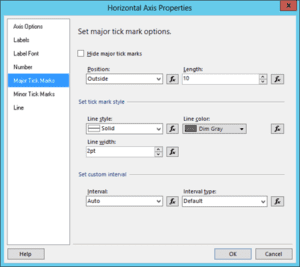
- Modify the Horizontal Axis property Major Tick Marks

-
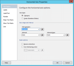
- Modify horizontal axis property Axis Type, and disable side margins.
 .
.
-
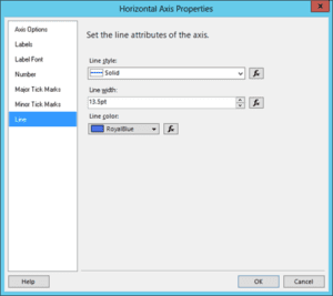
- Modify horizontal axis property Line and make the Label Font bold.

-
- Now select the Bar and go to the property window by pressing F4 and set properties as shown below:

-
- Hide vertical axis and run the chart report, timeline chart will be displayed as shown below:

Conclusion:
This timeline chart can be exported in PDF and shared across the team. Similar approach can be used to represent seminars within the years or any scenario.


