Table of Contents
Gartner recently positioned Microsoft’s Power BI as a leader in their annual magic quadrant for business intelligence and analytics Platforms. Also, for the second year in the row, Microsoft is placed farthest in vision within the leader’s quadrant. The reason behind this achievement is mainly because of the new exciting features Power BI team releases every month. Let’s have a look at few of the key features released in february and march 2018.
1. Formatting changes:
We can now control the labeling of data in scattering and another kind of cartesian charts. This improves the readability of the report and helps in a situation when data labels overflow the bar in charts. You can also change the size and background color.
Similarly, the size of the axis labels can also be controlled now to increase the percentage of the chart used by the axis labels.
Another formatting feature added is the bar/column padding control. PBI desktop users can now search the analytics/formatting pane. This is helpful because there are many options available under these panes and it has now become easy to browse through them. A live report can be found at Financial Performance Analysis Report to see the formatting changes.
2. Sync slicer:
In March, the PBI team delivered the most requested feature on the ideas forum. With the help of sync slicer feature, we can now synchronize all the pages where the sync slicer is applied. This means that if I select any slicer/filter on a page, the same filter selection would be applied to other pages where the sync mode is on.
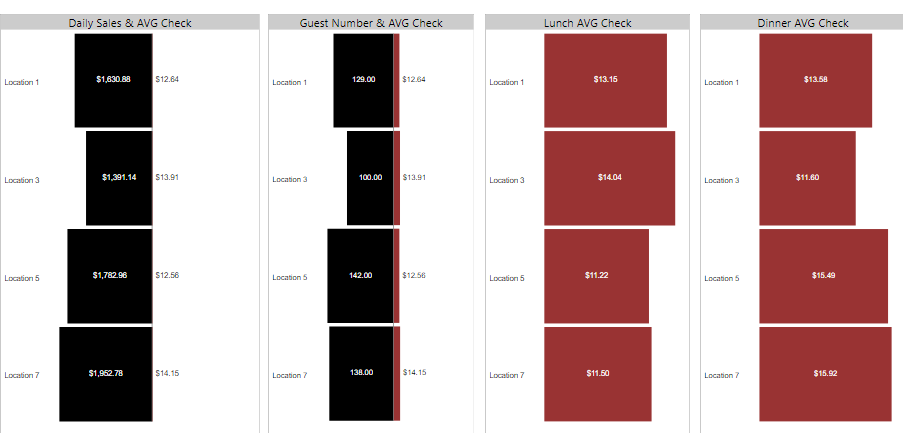
In the following image we can see that four locations are selected on Page 1
When we move to the next page, according to sync slicer information, of these four selected locations should be displayed. Please check the live report at Restaurant Real Time Report
3. Bookmarking:
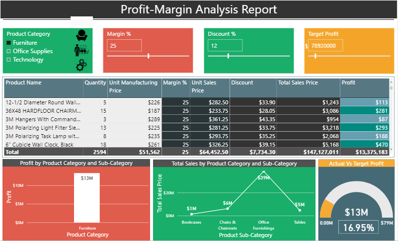
Though bookmarking was released in october 2017 , but now it is generally available. Bookmarking helps users create storytelling like experience. There are many use cases of bookmarks. Collection of bookmarks can help in presenting a series of insights thus enabling storytelling aspect of BI which is important these days. An interesting analysis of Profit Margin is available in this report which illustrates a company’s profit and total sales by changing margin and discount percentage. The Profit-Margin Analysis shows how much of profit would be generated on the specified values of discount, margin and target profit. Click on the image icons on top left corner to see the magic of bookmarks.
4. Custom visuals:
One of the main reasons behind the success of PBI is custom visuals. Think of a scenario where you must show your data in the tree visualization format or in box and whisker plot. In other BI tools, you need to create the visualization from scratch thus taking a lot of time. But in Power BI you can make such as visual in few clicks. That is the beauty of custom visuals. There are many custom visuals available in the app source. Let me discuss few of the important custom visuals.
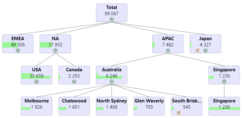
- TreeViz: TreeViz represents your data in a tree–like structure. It is good when one wants to organize the data hierarchically. Expand the nodes to see the next level in hierarchy. We can add as many levels we want.
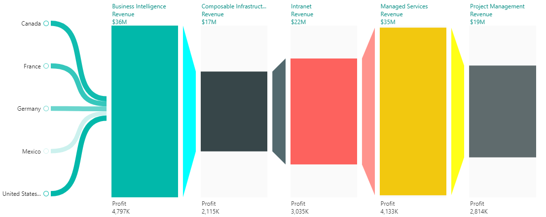
- Funnel by MAQ software: The Funnel with Source custom visual is perfect to track any metric of interest over various stages along with the source of entry of the data point to the funnel.
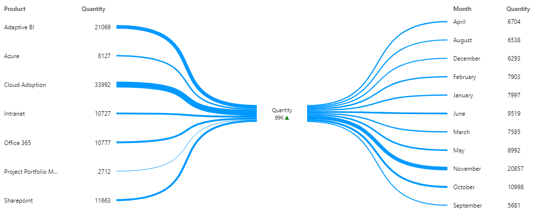
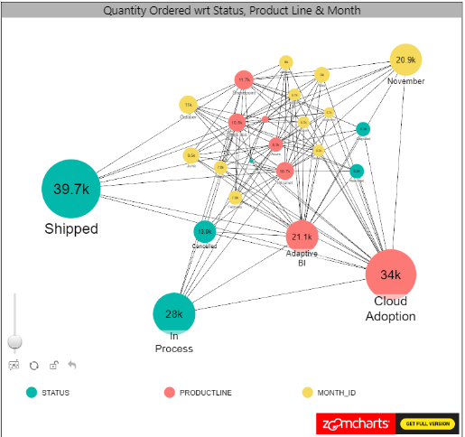
- Network visualization and filter: This chart visualizes data as a network which lets you see flow between various categories. Categories are displayed as nodes and are connected via line. The size of the nodes represents the magnitude of a category. The network structure makes it possible to see the connections among many categories.
5. Tool tip:
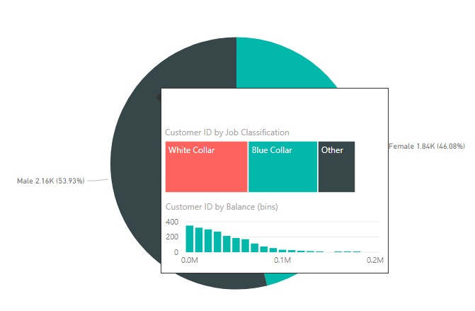
This feature is the latest one which was released in this month. Now we can create visually compelling tooltips which will pop up when you hover over visuals, based on report pages you create in PBI Desktop. These tooltips include all the visuals which are created in the report page of tooltip. This automatically filters the data point of the visual on which mouse is hovered.
5) Tool tip: This feature is the latest one which was released in this month. Now we can create visually compelling tooltips which will pop up when you hover over visuals, based on report pages you create in PBI Desktop. These tooltips include all the visuals which are created in the report page of tooltip. This automatically filters the data point of the visual on which mouse is hovered.
These were few of the updates which Power BI releases every month. The Power BI team works continuously on improving and enhancing the capabilities of the entire Power BI ecosystem. This is making Power BI number one choice in the business intelligence and data visualization software industry.


